纯Css鬼眼动画特效Html5
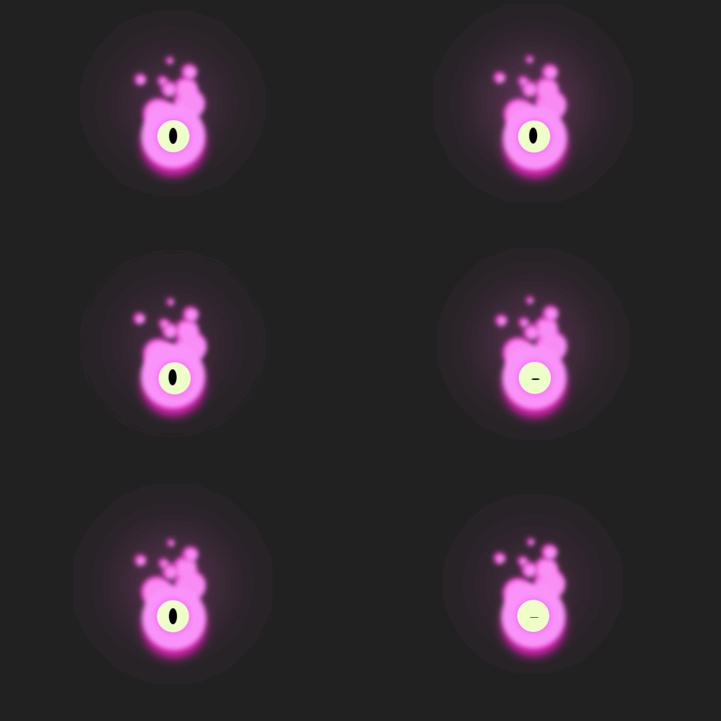
div class="loader">div class="head">div>div class="flames">div class="particle">div>div class="particle">div>div class="particle">div>div class="particle">div>div class="particle">div>div class="particle">div>div class="particle">div>div class="particle">div>div>div class="eye">div>div>
.loader {display: flex;width: 8rem;height: 8rem;justify-items: center;justify-content: center;align-items: center;}.head {width: 100%;height: 100%;background-color: #FA95FB;border-radius: 50%;animation: move 3s linear infinite;box-shadow: 0 1rem 1rem #E220B8;filter: blur(.3rem);z-index: 1;}.eye {display: flex;position: absolute;width: 4rem;height: 4rem;background-color: #EFFFC8;border-radius: 50%;align-items: center;justify-content: center;z-index: 2;box-shadow: 0 0 1rem #F752F7;animation: move 5s alternate infinite;}.eye::before {content: "";display: flex;width: 1rem;height: 2rem;background-color: #000;border-radius: 50%;animation: blink 4s ease-in-out alternate infinite;}.flames {display: flex;position: absolute;z-index: 0;}.particle {display: flex;position: absolute;background-color: #FA95FB;border-radius: 50%;filter: blur(.3rem);border-top: 5px solid #E220B8;border-left: 5px solid #E220B8;}.flames::before {content: "";position: absolute;width: 8rem;height: 8rem;background: #f865d8;filter: blur(5rem);opacity: 0.5;border-radius: 50%;top: -8rem;left: -4rem;z-index: 4;animation: pulse 3s linear infinite;}.particle:nth-child(1) {width: 4rem;height: 4rem;top: -6rem;animation: move 7s alternate-reverse infinite;}.particle:nth-child(2) {width: 1.5rem;height: 1.5rem;top: -8rem;left: -5rem;animation: move 1.5s ease-in-out reverse infinite;}.particle:nth-child(3) {width: 4rem;height: 4rem;top: -5rem;left: -4rem;animation: move 8s alternate-reverse infinite;}.particle:nth-child(4) {width: 3rem;height: 3rem;top: -7.5rem;animation: move 4s alternate-reverse infinite;}.particle:nth-child(5) {width: 2rem;height: 2rem;top: -9rem;left: 1rem;animation: move 2.5s alternate-reverse infinite;}.particle:nth-child(6) {width: 2rem;height: 2rem;top: -6.8rem;left: -1.5rem;animation: move 5s alternate-reverse infinite;}.particle:nth-child(7) {width: 1rem;height: 1rem;top: -10rem;left: -1rem;animation: move 1.2s alternate-reverse infinite;}.particle:nth-child(8) {width: 1.3rem;height: 1.3rem;top: -7.5rem;left: -2rem;animation: move 2.5s alternate-reverse infinite;}@keyframes move {0% {transform: translate(0, 0);}50% {transform: translate(4px, 6px);}100% {transform: translate(0, 0);}}@keyframes blink {20% {transform: translate(0, 0);height: 2rem;}30% {height: 0;}40% {transform: translate(5px, 10px);height: 0;}50% {height: 2rem;}70% {transform: translate(-10px, -10px);}90% {transform: translate(0, 0);}}@keyframes pulse {0% {opacity: 0.5;}50% {opacity: 1;}100% {opacity: 0.5;}}
相关阅读